Friday 31 October 2014
Tour de France Report
Beginning of this project, i began my research with primary and secondary. My primary research came from photographs taken from the Civic at the Bike show. I took plenty of photographs, from bikes to photographs of the previous age when Tour de France began. My secondary research came from the internet, with many photographs and information about Tour de France. Unfornatly, i didn't do any observational drawings. Because i wasn't really interested in the project we was set.
At the Civic, there was a couple of things that inspired me. Such as; Bikes and tyres. Because it was intresting to learn how bikes were back in the day and made into what they're today. Also, was great to learn about tyres and how many shapes and sizes of the wheels made. What i didn't like about the exhibition, was that the place was set out boring. In my opinion, everything was basic and boring to look at. And again i wasn't really interested in the project Tour de France, so i didn't really enjoy going to the exbition.
For my artist research, I'd only had a collagraph graph artist and a printing artist based on the project. Which were; Elenor Grosch and Bonnie Murphy. Eleanor Grosch's work is based on posters and printing work. Her work is something a lot more different, compared to looking at a painting. But instead a crazy, colourful piece of work, which makes you ask and look at it in a different way. In my work i took whole lot of her ideas such as; sunflower fields, Alpe D'Huez, Mont Ventoux and the Arc De Triomphe. Bonnie Murray's work is really impressive, with her skills and talent when using collagraph. In some pieces of her, she only uses Black and White collagraph. Which really brings out the image on what Bonnie is wanting to create. It's neat and very simple, sometimes she adds colour into her collagraphs. But in my opinion i perfer Black and White, with them being bold and light colours which blend with the image. Which makes the image effective.
Techniques i have covered during this project is, screen printing, etching, lino printing, tracing and collagraph printing. With all these techinques i'd created many prints. The experimention i did we these techinques were applying different paint or ink onto our created design, then placing our wet design onto a roller machine with damp paper on the other side to create a print. During the experimention i tried many different colours and patterns. But there was some occasions, were the colours i'd chose mixed together and created a dark and horrible colour.
To decide on our final pieces, we all were seperated into different groups of three. From there we all had to show our pieces of work to one another and explain our reasons why we created these pieces. Once we explained our reasons also ideas about our work, afterwards two of us had to decided which were the person's good pieces and bad pieces so that they had a idea on there finally design.
During this project, i would say my time management went good. There were some points during the project were i lost track of time and began to complete stuff slowly. Because we had many other things happening and what we had to do, whether we liked it or not. I did get quite annoyed too, with being so focused on one thing then being told to start another. I do think my time management could work a little bit more. Because there is still a thew pieces of work that needs completing.
I would say the only thing that went wrong was my chosen colours, when printing with etching, lino and collagraph. Because the colours i'd chosen went horrible when being mixed. And most of the colours i experimented with was dark. The thing that went well for me was my ideas, they went exactly how i wanted them to go. I would change some of my ideas and try to expand them a little further, so that i can create some great experimentations and pieces of work. Overall, i am okay with the project. I mean this project went on for too long and i got really tired and bored of the topic, especially when it was first mentioned. Also i do think i could have done more for this project and tried a little harder.
Monday 20 October 2014
Screen Printing
To start screen printing, you must have every material and media you're using ready. Such as; Calico, Silk, Cotton, chiffon, satin or either paper (if you wished to use). You can basically print on anything, piece of clothing, any previous worksheets you have. Afterwards, you then need to make sure you have them at the correct size as your screen. Because with my screen, i did it at the size of A4 but my pieces of material. Were at the size of A5's so when it came to screen printing over my fabric, not all of my screen design went onto my material. Next, you need coloured ink which is known as Procion Dye. You can use as many colours you may wish to use. For us, we already had a mixture of colours placed out. Like Blue (Dark and Light), Red, Orange, Yellow, Green etc. Once your colours are done, you're ready to begin your screen prints. You need to place, which ever material you wish to print on, underneath your screen. Choose your colour or colours (If you wish), put a good amount of pigment onto your screen. Then grab your squeege and press down hard onto your pigment colour. Carefully, drag it down once then up and again. To make sure that the colour pigment, has covered your choosen material to create a print. If, you're successful and your print came out perfectly. You can then either wash your screen and squeege, with the jet wash. Or contiuning printing with the exsiting colour or colours, you have used to make more effective screen prints.


 I first started off with a piece of white cotton at A5 size. We had to begin starting with creating backgrounds, to print on afterwards. My first choice of colour was dark Blue, simply did a dark Blue background. Afterwards, i came up with the idea to dab my other white cotton sheet down onto the table, where the left over procion dye was. And within a second the white cotton fabric started to have a 'splat' effect to it. But unfortnaly, not all of the procion dye covered the whole white cotton sheet. So that's when i decided to add a different colour into my prints such as; Red. I did the same again with the procion dye Red and this time the dye covered the rest of the white, cotton sheet. The colours together, gave my background a dark also colourful effect which i was impressed. Once i'd taken my two print sheets over to the drying rack. Again i used the same method by getting a plain, white cotton sheet and dab it all over the left over procion dye. I was really pleased this with how the left over, procion dye soaked into my white cotton. And gave my background a nice, light and calm colour to it. For my final white cotton sheet, i decided on using as completely different colours. I went for Blue, Yellow and green. Using the 'splat' effect, i strongly believe that i could have tried harder with the background choices and colours. But i am pleased with myself, that i tried and joined in with this activity.
 When all my backgrounds were on the drying rack to dry, during that time we were asked to make paper to also use on screen printing. When my new pieces of paper were dry, i was then ready to use them with my backgrounds. With all my pieces of paper and backgrounds, i then placed each piece one at a time under my screen and began printing over them. I tried to use various colours, some bright and dark. For my white cotton sheets, i printed two sheets in Blue pigment. The next one in a little bit of Red, Orange and Pink. This one was my favourite out of them all. Because the colours are light and colourful. This screen print design is really neat and effective, in my opinion it drawns you into it. Because of how the colours blend with one another. My final white cotton sheet, i came up with the idea to have one side a colour and the otherside a different colour. The colours i'd chose was Orange and Brown. Because i then have a light and dark colour together, which i was hoping that will look great. Happily to say, everything went exactly how i hoped. Both colours covered the exact sides, were i wanted them. Giving the print design a crazy, weird effect when you look at it. Because you're not just looking at one colour, but both colours dark and light. The previous four white cotton sheets (backgrounds). I decided to use the Black colour pigment. Because of how dark my backgrounds became, so that when i screen printed over them. The Black pigment will stand out, prefectivly. Because Black goes with anything. But for the Blue, Yellow and Green background, i thought about using grey. Because at the time, the Grey pigment looked dark and i began to think that the screen print design will come through nicely. Unfortunatley, the Grey pigment came out very weak and faded a lot.


 Next was my own made paper to print onto. I started off with the smallest piece i'd made, which was a small square. I truely hated this print design. Because it is too small for all of my screen print design, to fit on. Also, the Black pigment i'd used was too much. Which made the print come out in a messy, smudgey way. Because the design hasn't come through propelly with the amount what was on. My next paper print was shaped as a circle, this screen print design i was really impressed with. Because the pattern came through nicely, smudged a little bit but still looks effective. The colours i'd chose was Black and Brown pigment, i tried to give it a two toned colour. But instead middle half of was Black and the top and bottom were Brown. Overall, it was impressive because of the pattern and with the shape of paper.
Next design, again i wasn't impressed. Because the colour pigment, i'd used was yellow. And once i took the paper off my screen to check my print design. Some of the design came through, but the colour i'd chose was too bright. And doesn't look too good or effective. Because the brightness of the colour i used. Futhermore, my next paper print design i wasn't really happy with. Because the amount of pigment i put on my screen, was too much for the paper. When i'd used the squeege up and down on my screen, instead of only doing it twice. I did it at least, four to five times. So during that time am just adding more and more pigment onto my paper. Finally, my last paper print design was a complete mess. Because the brusho inks, i sprinkled on the paper. Has given it a really dark and too much of the colour. I don't mind too much of the tissue paper i used. But also, the colour pigment i'd chose was too light and didn't show up well enough. If i'd chose black for my colour pigment, i then would have had a good chance of my screen print design, standing out.
Next was my own made paper to print onto. I started off with the smallest piece i'd made, which was a small square. I truely hated this print design. Because it is too small for all of my screen print design, to fit on. Also, the Black pigment i'd used was too much. Which made the print come out in a messy, smudgey way. Because the design hasn't come through propelly with the amount what was on. My next paper print was shaped as a circle, this screen print design i was really impressed with. Because the pattern came through nicely, smudged a little bit but still looks effective. The colours i'd chose was Black and Brown pigment, i tried to give it a two toned colour. But instead middle half of was Black and the top and bottom were Brown. Overall, it was impressive because of the pattern and with the shape of paper.
Next design, again i wasn't impressed. Because the colour pigment, i'd used was yellow. And once i took the paper off my screen to check my print design. Some of the design came through, but the colour i'd chose was too bright. And doesn't look too good or effective. Because the brightness of the colour i used. Futhermore, my next paper print design i wasn't really happy with. Because the amount of pigment i put on my screen, was too much for the paper. When i'd used the squeege up and down on my screen, instead of only doing it twice. I did it at least, four to five times. So during that time am just adding more and more pigment onto my paper. Finally, my last paper print design was a complete mess. Because the brusho inks, i sprinkled on the paper. Has given it a really dark and too much of the colour. I don't mind too much of the tissue paper i used. But also, the colour pigment i'd chose was too light and didn't show up well enough. If i'd chose black for my colour pigment, i then would have had a good chance of my screen print design, standing out.


Wednesday 15 October 2014
Making Paper
Previously, last year we was already taught how to make paper and making prints afterwards. However; here is another example on how to make your very own paper. Firstly, you begin with setting out three trays into the middle of the table. Filled with old, mushed up pieces of scrap paper mixed in with water. So that the paper sets onto your frame to make the shape of your choice. Such as; you can have frames either square, circle (other shaped frames, if you have one.) Once you have selected the frame you would like, you then need to collect a red cloth. So that when you have placed your frame into the tray with all the used old, mushed up paper. You then need to place the frame onto the red cloth, after that you need a dry sponge. Pressing down hard on your frame and paper, to collect up much water as possible. Because your paper will be able to take it's shape and easy to peel off afterwards. Once you have managed to collect up all the water as you can, you then can place it on the drying rack. Making sure your name was on every piece of work, you have created.
I'd managed to create a thew examples, each were just basic, mussed up paper and some with coloured tissue paper on top also sprinkles of brusho inks. We were told to create as many as possible and try out various techniques on our papers. To test which is better and worst to use, when making paper. I strongly believe that i could have kept on making paper. Also use different patterns and shapes on my paper samples, instead of sticking to plain and basic things. However, for my last samples i did use coloured tissue paper. Which i'd cut and ripped into different pieces, making sure the paper would have a different texture when printing afterwards. Again, same with brusho inks. Though i did find it quite messy and hard, once i'd started sprinkling a brusho ink over my paper. I am hoping that, once the paper is dry and i start printing over it. I would eventually have a nice, paper texture. Overall, i did find this experiment quite interesting. On how to make paper and all the various textures there are and techniques you can use.


World War 1 Exhibition
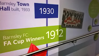
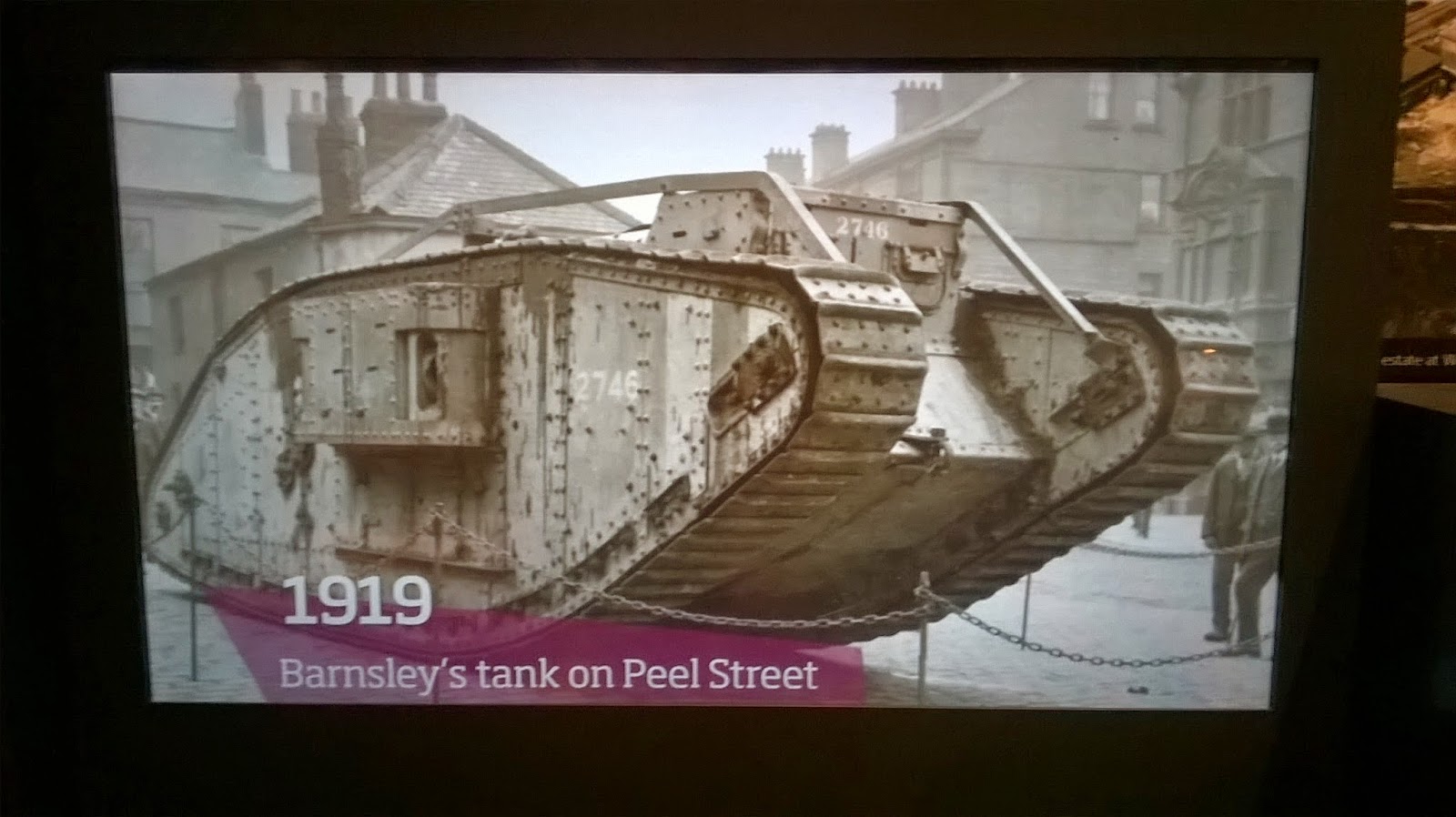
The photos shown below, show items and information based around the era in World War 1. The photos were taken at the Town Hall at the exhibition. There were many fantastic displays, from old kettles, televisions, coins, radios, prams, clothing and so much more. Looking through all these displays made me think and wonder how things were back in that time and how i could cope without the things i have today. On one side of the exhibition, there was a screen showing photographs taken when the first world ward began. It wasn't nice to watch the photographs showing buildings blown up, tanks roaming the streets and men fighting in the war to save our country. But overall, it was a great experience to visit the exhibition and learn all the history taken from the first world war.


Subscribe to:
Posts (Atom)