Here is my portfolio of work from Art and Design Level 3 at Barnsley College. And some pieces created at home. Feel free to leave comments, like and share.
Thursday, 9 October 2014
Etching Printing
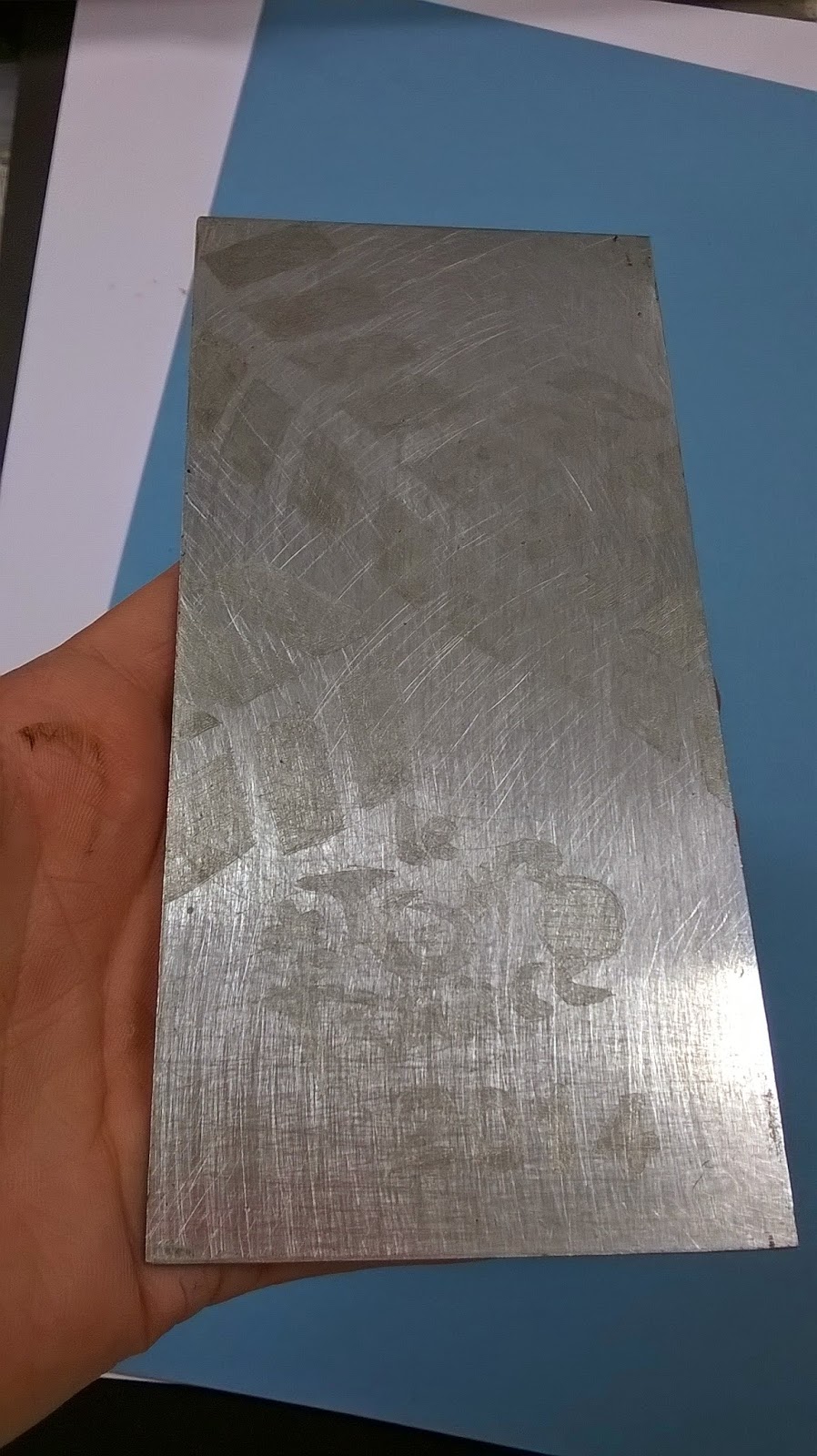
To start an etching print, you must begin with having the correct materials such as; a zinc metal plate, black-hard wax, hot plate (To heat your zinc, metal plate and hot wax.) polish, tracing paper, pencil, steel etching needle and oil-based or either water-based inks. You start by drawing a design onto your tracing paper, then once you have finished your design. You must then heat up the 'Hot Plate.' Which is a plate that heats up your zinc, metal plate. So you can spread the black-hard wax over your plate. To create a coat and which helps the plate, when you later put your plate into acid. Afterwards, you then trace your design onto your zinc, metal plate. By placing the tracing paper over the zinc, metal plate then going over your design again. After that, you then use the steel etching needle and begin to scratch the design you have created on your zinc, metal plate. Once you have scratched into your design, you must then wipe off the black-hard wax with polish. So then your plate will have a nice shine to it. Finally, when you have managed to clean off all the black-hard wax. You are then ready to start printing. By using either water-based or oil-based inks, which you will need gloves and a piny. To help not getting the ink onto your clothing and hands. You can have many colours as you wish onto your etching plate. When you have covered your plate, you need to make sure you have wiped off any useless ink off your plate. So that, when you place your plate onto the roller machine. Your print won't come out correctly, and you will have smudging on your print. Once you have wiped off any useless ink off your plate, you're then ready to place your plate under the roller machine. Before rolling your plate under the machine, you need to place a damp A4 sheet of paper on top of your plate. So the roller machine can create an etching print of your design.
At the beginning, i did find etching quite easy. Because of how simple the method was for creating a etching print. But in my opinion it isn't as easy as you think. Because you had to wait for at least 30 minutes for the hot plate to heat up. Including, the black-hard wax you use to cover your plate. Secondly, you always need to remember to scratch letters backwards onto your plate. Because once you have rolled your plate out, on the roller machine. The letters will come out backwards on your print. Lastly, the acid was very weak and hasn't been changed in a while. So you then had to wait for 20 minutes at least. For the acid to remove the black-hard wax and your design will show up nicely once cleaned. For my first try at etching, i didn't leave my plate in long enough for the acid to remove the black-hard wax. Which also ment that my design wouldn't show up, when rolling out my design. Luckly, for my second try i'd managed to create at least two etching prints. The design i'd chosen was a basic and simple idea. Because with me not created an etching for a long time. Was two bike, tyre tracks going across either side. And the main title 'Le Tour de France 2014' at the bottom.
Below, there are photographs i'd taken of the steps when creating an etching.
Sunday, 5 October 2014
Lino Printing
Lino printing was my favourite printing method. Because Lino is a really thick, rubber material which i find easy to carve and draw onto. This was the first time i have ever created a Lino printing, so many ideas were small and basic. Such as; i decided on a bunting going across the Lino and then the title on the right corner. And for the bottom i decided on drawing the Yorkshire Rose. Once i decided on my drawing ideas for my Lino printing, i was then ready to start carving into my drawings. By using a cutting tool called Baren. I found it quite intresting using the Baren. Carving into the lines of my drawings, was a smooth texture and picked up very easily. Once i finished every outline of my drawings with the Baren. They began to stand out and shown a nice design on my Lino. Finally, i was ready to add water-coloured based ink on my Lino to create some Lino printings. For my first choice of colour, i'd decided to go with a Turquiose colour then put my Lino under the roller machine. My first print didn't come out aswell enough. Because the Yorkshire rose smudged while going through the roller machine. For my second print i'd decided to use the colour black, which looked effective after i'd used Turquiose. Only this time when i place my Lino under the roller machine, my Lino printing came out crickley. At this point i'd had enough, but i'd thought about trying one more time to see if i'd get a better result. So this time, i'd washed my Lino down and then used the colour Green. Results i'd got this time was alot better, especially with the colour Green. In some areas i could have go back over with the Baren. To make my drawings and the outlines deeper for the Lino printing to work. Lastly, i was impressed with myself and on how i'd stayed on task and created a nice piece of Lino printing.
Collagraph Attempt Two
Here is my second attempt at collagraph printing. My first attempt didn't go so well. Because of the colours i'd chosen. For my second attempt, i did the exact same layers for each shape i did. Only this time i'd mananged to create one collagraph print in the colour Blue. Because i wanted to see if i would get the same results like my previous collagraph, when i used a darker colour first. This time when i covered my collagraph in Blue water-based ink, making sure every corver and shape was covered. Next i used some magazine and paper to wipe off any left over ink on my collagraph. I was then ready to move onto the roller machine, which rolls the collagraph onto a piece of paper to create a collagraph print. Finally, once my print finished rolling on the machine. I was really pleased that i'd managed to create a collagraph print, especially you can just make out where the shapes have come through. Even though we were asked to create loads more of collagraph prints. I was happy with the one print i'd created and i didnt have much time left. Because i'd had various other tasks to finish.
Wednesday, 1 October 2014
Collagraph Mistake
After many lessons working hard on my collagraph, making sure there was enough layers on. Also, my collagraph was dry from varnishing it. Futhermore, finished sticking different materials down such as; cardboard, brown paper, black card and cartridge paper. I finally was able to move onto my next step of my collagraph, which was to start printing by using water-based inks. By spreading a colour water-based ink onto my collagraph, making sure every area was covered. Before we started spreading a colour water-based ink, we were asked to try and experiment with two colours. Because our collagegraphs will look more effective. When i tried to add two water coloured-based inks to my collagraph, it didn't go exactly how i thought it would. Because i had to constantly add a big amount of ink onto my collagraph and try to cover ever area, with a small piece of card. Futhermore, the colours i chose was Brown and Black. Because i wanted to have a Brown background and Black outlines showing were i have added extra layers. To give my collagraph a really good effect. Once i added the coloured water-based ink, Brown and managed to cover up all the areas on my collagraph. Next i had to get either newspaper or magazine and wipe down all the ink from the collagraph. So the layers am wanting to have a different colour, doesn't have the previous colour on them and that they're dry. Then, once i thought my collagraph was dry and ready. I rolled out the coloured water-based ink Black and then began to roll the Black, onto the layers i am wanting to colour. Unfortanly, the collagraph i was wanting to create didn't turn out as well. Because the Black coloured water-based ink didnt go onto the layers i was wanting to colour. Instead it went all over my background colour Brown, which made my collagraph very messy and look untidy. I wasn't really happy with the results i got, but i was determined to carry on with my collagraph prints. Once i had my two colours on my collagraph, i was then ready to place my collagraph onto the bench. Which is a machine that turns a huge roll and places alot of weight onto the print, you're wanting to create. Once my print came out from the otherside of the bench, i took out my collagraph but my print was stuck. I tried many times to carefully, release my print but at the end i ended up wripping my print. So i throw away the print and then i wasn't really intrested in collagraph after that. Because of how my print turned out also the colours i used. Lastly, when i returned to the classroom. I took some time to relax after getting annoyed with my results of my collagraph. And began to create another collagraph, to see if i get the same results again.
Tuesday, 30 September 2014
Tour de France worksheets
The first worksheet i was asked to create, was a moodboard. With all of my inspiration and ideas of The Tour de France. Firstly, i got my secondary research which is taking images from the internet to use in my work. The images i used were just basic and simple images based of The Tour de France. Such as; bike riders, french flag and the Yorkshire Rose. Futhermore, once i had my secondary research. I was then ready to stretch A3 sheet onto a board. Using gumstrip, blueroll or toilet roll and water to stick down the A3 sheet onto the board. Then when my board was dry enough i was then ready to stick down my images and start some sketches. My sketch ideas came from the images i printed off earlier and some taken from my sketchbook. The media i used on my moodboard was, watercoloured paint, gouche, coloured pencils, pencil and little bit of collage. I do think i could have been more creative. By drawing sketches with more detail and making them bigger. Also there are some areas where i could have go back to and went over with. To make them more eye catching and at a great standard.
Second worksheet had to be an artist research page, their work had to been from the topic Tour de France. It did take me a while to find an artist who's work really stood out to me. Eventually, i came across an artist called Eleanor Grosch. Her work is simplified, playful illustrations and bold, colorful design work. Which is she is very well known for. She enjoys drawing animals, the nature of her work inspired artwork for band posters. Like Wilco, Edwin McCain, Elefant, and Dave Matthews Band early on. The reasons why i chose Eleanor's work. Is because she uses simple and crazy shapes to create either an animal, human or place. And her use of very bold colours makes these shapes stand out and create the image, Eleanor is making. I strongly believe that this worksheet, is my best sheet i've created. Because i've used all the page up, with no white spaces showing. Futhermore, i have used different media such as; gouche, watercoloured paints, coloured pencils and collage. On the right side of my worksheet i did an impressive sketch used in collage. The collaging took me a while to complete, with me having to use different maganzine's and colours. Especially, with my sketch drawn out large. I am really proud of the collage, i have created and now more confident with using collage.
Lastly, my final worksheet had to be a visual sheet. Which means taking all ideas from sketchbook, moodboard and artist research. And then put all my ideas onto another A3 sheet. Once i stuck down an A3 sheet down onto a board, i thought about having a background instead of starting to put my ideas down. Eventually, i decided to use an ink and paint background by putting my paintbrush into ink and making spalt effects onto the sheet. Then do the same method again, instead using paint. Once my background was dry, it started to look effective and a great background. I began my sketches with bike tyre patterns, pieces of Eleanor Grosch's work and various other sketches such as; UK flag, finish flag and the Yorkshire rose. Another sketch i added was the words taken from an image i printed off earlier "KEEP CALM AND TOUR DE FRANCE." I re-created these words in collage, the colour i used was Blue and does look good. But i strongly believe that, if i used the colour Black instead the words will stand out more. But i already used Black for the bike tyre patterns and perfered to mix colours around to have a bright, creative visual sheet. There are some sketches i do believe i can go over a little more such as; French flag, jerseys, bunting. Because they don't really show up as much on my sheet. These sketches mostly blend in then stand out. Futhermore, there are some areas where white space is showing and i will need to continue adding more visiual sketches. Finally, the media i used on this worksheet is pastels, soft pastels, watercoloured paints, gouche and collage. Throughout all my worksheets, i am really glad and impressed with myself for using more media and being more creative.
Thursday, 4 September 2014
Tour de France
For this project it was all based around The Tour de France. We were told to make a sketchbook with many annotations, Photographs and drawings of either bikes, riders, maps, (3x) artist research and anything of our choice based on the project. In my opinion i wasn't really interested in this project at first with it being all on Tour de France. Specially with just bikers riding so many miles through towns and villages. But eventually when i started getting ideas what to draw and design in my sketchbook, i started to enjoy the project a little. I decided to do A4 Sketchbook, because i perfer small paper when am drawing and with me not interested in the project i didnt feel up to it. During the time of The Tour de France, we visited a bike show at The Civic in town. Inside there was many displays showing The Tour de France over the years. Especially, models of bikes and tires. Furthermore, there was alot of good information and images to help me with this project. I took many photographs while i was there, it was really helpful visiting the Civic.
For my first page of my sketchbook i designed a simple and basic front cover with just the title 'Le Tour de France' in very big letters. Also i only used black paint for the colouring of the letters. Secondly, i decided to have a mind map for my second page. I added alot and many good facts based on The Tour de France, i do think i could have made my mind map more colourful and outstanding. Instead of, writing basic facts on the subject. Thirdly, i decided that for my third page i was going to do a simple collage from a newspaper we were handed from the Civic. I cut out jerseys on what the bikers wear, bikes and the main title 'Bike Show.' My fourth page wasnt at a good standard in my opinion. Because i'd drawn a biker on a bike, cheering after going through the finish line. With a photograph of a biker years ago stuck at the corner then on the other side i stuck a saying based on The Tour de France saying 'A LIFE LONG LOVE OF ALL THINGS PEDAL POWERED.' I strongly agree that i could have done better on this page. The fifth page in my sketchbook was really good and more outstanding in my opinion. Because i'd drawn from a image online and re-created it in watercoloured paints. The image was seven bikers on the road, racing for The Tour de France with sidewalks at the side. This page is my favourtie so far. Because of how i concertrated on the colours and details of the image i was re-creating. Sixth page in my sketchbook i made a collage. Of a famous biker called 'L'ORTOLAN.' It took a long time to collage, but i was really pleased how it turned out in the end. The seventh page in my sketchbook i looked online for images based on Tour de France and found a photograph some took of a road with the direction to The Tour de France and with a field and road in the background. For this page i decided to be more creative and push my comfortable state with using different media and i decided to use pastels. I dont use pastels often because i hate how they smudge and make a mess of work afterwards. But at the time that was the only different media i could use, once i completed the drawing and coloured it in with pastels i was really impressed with myself how i used the pastels. The next page of my sketchbook i did a drawing of a painting which showed a village area and the bikers in the distance. It took me sometime to re-create this painting. Because there was alot of detail in this painting also i had to mix watercoloured paints alot to get the exact colour. Next two pages i did some more collaging. Because i dont really do collage and with the photos i took from The Civic i decided to stick the photos down and make a collage. My last page i did a drawing of a sculpture in a tree done in Harrogate. I re-created this image in shading pencils. Because i am confident when shading and drawing in pencil, with it being easy to rub out mistakes and keep going over it.
Wednesday, 18 June 2014
Vintage Project Evaulation
For my chosen era I chose to research on the 1950/1960's. Because I know a little history between 1950/1960's with The Beetles, Elvis Presley and specially the ROCK N ROLL times. My mum is a huge fan on Elvis Presley and she has many items on Elvis such as; photographs, paintings, t-shirts, cups, films, books and even a cardboard cut out. So mainly Elvis Presley was my main idea and era to look at. The research I began with was every topic in the 1950/1960's time such as; clothes, music (records, jukebox) dancing and even hairstyles (Elvis Presley). My main aspect while looking into the 1950/1960's is the music (ROCK N ROLL). The main cultural influences for this era was Elvis Presley and Grease. Because Elvis Presley I've watched and listening to his songs and films. Also my mum is a huge fan on him. For my knowledge and research on Elvis Presley, I created a research page in my sketchbook about him. With images of Elvis himself and various items he used and worn. Futhermore, Grease is a well known 1950/1960's film set out in vintage. With ROCK N ROLL, colourful flair dresses, greasy tall hair, leather clothing etc. I had to create a mind map on my chosen era, I used a variety of images chosen from the internet based on my era I have chosen. I was really pleased with my mind map. Because of how many ideas I came up with and the drawings I produced. The media I used on my mind map were watercolours paints, coloured pencils and felt tips. To make my mind map little more interesting. When I completed my mind map, I then had to take some ideas from my mind map and create 4 bunting designs on A2 paper. Firstly, before I began designing my buntings I had to stretch A2 paper onto a board and create a background. For the first sheet background I decided to have ink. Because I wanted to have a really creative and bright buntings. The ink colours I used were green, yellow and orange. And then I poured little amount of ink onto my sheet, used a straw to blow the ink into different places to have a strange effect. Once my background was dry and ready, I then could start designing. I used a triangle template, similar to a pizza slice. And then drawn out 2 bunting shapes onto my sheet then began drawing. My first choice for my bunting was to start with clothes, such as draw out the clothes people wore back in the 1950/1960's. On the bunting I drawn, a flair dress, hat, spotted tie and shoes. Next bunting design i chose to do records, back then they didn't have CD'S they called them records. Records were a big black, round disc which played music. On the second bunting i drawn records all over my bunting and in the middle, i had drawn a record in a gold frame. Showing how records were shown back then. I used acrylic paints for my media. Because with the background i have, using watercolours or coloured pencils or even felt tips. These sort of media wouldn't show to good on ink background. With acrylic paints they stand out more from the page, bringing out the image more. Then once my first bunting design sheet was completed, i started my second design sheet using same method as before. Firstly, i couldn't design what background to use either have a bold, bright colour for my background or just leave it plain. But then i came up with the idea of getting different coloured paint onto a paint pallet and simply flick the paint onto the sheet. Making it look all crazy and colourful. It did take some time though to dry, Eventually, i could draw out my bunting template and start my last 2 designs. My third design was Elvis Presley. Because i had a lot of research and knowledge about him, so simply i used ideas taken from my mind map. I started off with a bold title, which was his name. Then below that i drawn some images of him and one of his first ever records. I wasn't too happy with the media i used for this bunting, which was coloured pencils. Because i didn't use the right artist coloured pencils. Instead i used my very own, which were quite cheap and useless in my opinion. Because you don't get much colour out of them and leaves the image you colour a mess. Lastly, for my final bunting design i came up with a idea of using Peter Blake style of work. Taken from my artist research because i am really fascinated by his work and how he shows it. So i created on of his grid designs with various things in the vintage times. Such as; the England flag, united states flag, rainbow (peace), red star and black and white. But i do think i could of added for of Peter Blake's work. Because in some areas of this bunting were empty. But in the areas what were empty, shows my background off very nicely. Futhermore, when both A2 sheets were done and had all 4 designs completed. I was then ready to heat transfer my buntings, which it was the easier solution with the little time i had. Before i could heat transfer my buntings, i had to go downstairs and have my designs made onto magic touch paper. So that when i do heat transfer my designs they will simply go straight onto the calico. When the magic touch paper was done, i was then ready to use the heat presser machine. The temperature had to be at least 180 degrees, for the design to fully heat onto the calico. For each design i heat pressed, i quickly had to peel off the magic touch paper away from the calico. Because it would make the design fade. This time using the heat presser i felt more confident with using it. Because before i had to have someone use it for me and i didn't do it to the right temperature. Furthermore, when i used the heat presser for all designs i then had to use crocodile scissors instead of ordinal ones. Because the crocodile scissors while stop the calico from shredding and it gives the bunting a nice pattern along the sides. My time management throughout this project was handled okay in my opinion. Because with other topics and work we had to do, i lost time for this project. Also i was getting too busy and focused on other work, i could have improved my time management by getting equipment for Art. Because when i take my work home some occasions i couldn't complete my work, without the proper equipment. In my opinion it was a challenge this project, having to create and complete it all for a client. Doing this project for a client has showed me what work is like when being an artist. With getting things done and ready on time. Overall i am satisfied with the designs i came up with also that i created some buntings. Because when it came close to handing it the work, i was worried that i wouldn't be able to have my buntings ready. But eventually, i managed to get other work completed and had time to get my buntings completed. I wouldn't change anything for this project, it's been a challenge and interesting to be part of.
Subscribe to:
Posts (Atom)