Wednesday, 18 June 2014
Vintage Project Evaulation
For my chosen era I chose to research on the 1950/1960's. Because I know a little history between 1950/1960's with The Beetles, Elvis Presley and specially the ROCK N ROLL times. My mum is a huge fan on Elvis Presley and she has many items on Elvis such as; photographs, paintings, t-shirts, cups, films, books and even a cardboard cut out. So mainly Elvis Presley was my main idea and era to look at. The research I began with was every topic in the 1950/1960's time such as; clothes, music (records, jukebox) dancing and even hairstyles (Elvis Presley). My main aspect while looking into the 1950/1960's is the music (ROCK N ROLL). The main cultural influences for this era was Elvis Presley and Grease. Because Elvis Presley I've watched and listening to his songs and films. Also my mum is a huge fan on him. For my knowledge and research on Elvis Presley, I created a research page in my sketchbook about him. With images of Elvis himself and various items he used and worn. Futhermore, Grease is a well known 1950/1960's film set out in vintage. With ROCK N ROLL, colourful flair dresses, greasy tall hair, leather clothing etc. I had to create a mind map on my chosen era, I used a variety of images chosen from the internet based on my era I have chosen. I was really pleased with my mind map. Because of how many ideas I came up with and the drawings I produced. The media I used on my mind map were watercolours paints, coloured pencils and felt tips. To make my mind map little more interesting. When I completed my mind map, I then had to take some ideas from my mind map and create 4 bunting designs on A2 paper. Firstly, before I began designing my buntings I had to stretch A2 paper onto a board and create a background. For the first sheet background I decided to have ink. Because I wanted to have a really creative and bright buntings. The ink colours I used were green, yellow and orange. And then I poured little amount of ink onto my sheet, used a straw to blow the ink into different places to have a strange effect. Once my background was dry and ready, I then could start designing. I used a triangle template, similar to a pizza slice. And then drawn out 2 bunting shapes onto my sheet then began drawing. My first choice for my bunting was to start with clothes, such as draw out the clothes people wore back in the 1950/1960's. On the bunting I drawn, a flair dress, hat, spotted tie and shoes. Next bunting design i chose to do records, back then they didn't have CD'S they called them records. Records were a big black, round disc which played music. On the second bunting i drawn records all over my bunting and in the middle, i had drawn a record in a gold frame. Showing how records were shown back then. I used acrylic paints for my media. Because with the background i have, using watercolours or coloured pencils or even felt tips. These sort of media wouldn't show to good on ink background. With acrylic paints they stand out more from the page, bringing out the image more. Then once my first bunting design sheet was completed, i started my second design sheet using same method as before. Firstly, i couldn't design what background to use either have a bold, bright colour for my background or just leave it plain. But then i came up with the idea of getting different coloured paint onto a paint pallet and simply flick the paint onto the sheet. Making it look all crazy and colourful. It did take some time though to dry, Eventually, i could draw out my bunting template and start my last 2 designs. My third design was Elvis Presley. Because i had a lot of research and knowledge about him, so simply i used ideas taken from my mind map. I started off with a bold title, which was his name. Then below that i drawn some images of him and one of his first ever records. I wasn't too happy with the media i used for this bunting, which was coloured pencils. Because i didn't use the right artist coloured pencils. Instead i used my very own, which were quite cheap and useless in my opinion. Because you don't get much colour out of them and leaves the image you colour a mess. Lastly, for my final bunting design i came up with a idea of using Peter Blake style of work. Taken from my artist research because i am really fascinated by his work and how he shows it. So i created on of his grid designs with various things in the vintage times. Such as; the England flag, united states flag, rainbow (peace), red star and black and white. But i do think i could of added for of Peter Blake's work. Because in some areas of this bunting were empty. But in the areas what were empty, shows my background off very nicely. Futhermore, when both A2 sheets were done and had all 4 designs completed. I was then ready to heat transfer my buntings, which it was the easier solution with the little time i had. Before i could heat transfer my buntings, i had to go downstairs and have my designs made onto magic touch paper. So that when i do heat transfer my designs they will simply go straight onto the calico. When the magic touch paper was done, i was then ready to use the heat presser machine. The temperature had to be at least 180 degrees, for the design to fully heat onto the calico. For each design i heat pressed, i quickly had to peel off the magic touch paper away from the calico. Because it would make the design fade. This time using the heat presser i felt more confident with using it. Because before i had to have someone use it for me and i didn't do it to the right temperature. Furthermore, when i used the heat presser for all designs i then had to use crocodile scissors instead of ordinal ones. Because the crocodile scissors while stop the calico from shredding and it gives the bunting a nice pattern along the sides. My time management throughout this project was handled okay in my opinion. Because with other topics and work we had to do, i lost time for this project. Also i was getting too busy and focused on other work, i could have improved my time management by getting equipment for Art. Because when i take my work home some occasions i couldn't complete my work, without the proper equipment. In my opinion it was a challenge this project, having to create and complete it all for a client. Doing this project for a client has showed me what work is like when being an artist. With getting things done and ready on time. Overall i am satisfied with the designs i came up with also that i created some buntings. Because when it came close to handing it the work, i was worried that i wouldn't be able to have my buntings ready. But eventually, i managed to get other work completed and had time to get my buntings completed. I wouldn't change anything for this project, it's been a challenge and interesting to be part of.

Evaulation Fine Art
For the start of this project I began by creating a mind map on the topic "Yourself." On my mind map I wrote many things about myself such as; hobbies, interests, family, friends, holidays I've been on and my future. Also on my mind map I added photos of myself from a younger age. After my mind map was completed I then started my 4x sheets on the things that either make me happy or things I like. My first page was about me and my best friend Tasha. Because Tasha is a very special person in my life and we've know each other for many years. Me and her have shared and created a lot of great memories. The media I chose for this page is watercolour paints. Because the photo I chose to re create of me and Tasha, the colours were dark and simple. Secondly, I chose my family because I have a wonderful family and we've shared some great times together. Media I chose for this page was coloured pencils. Because I wanted to make a change of my media. Thirdly, I chose my dog Smudge. Because he's my pet and been apart of my life for a long time. The media I chose for this page is collage. Because I wanted to show how creative I am also I wanted portrait of our smudge to stand out. My last page is about me and my boyfriend Matt. I chose this topic because he's very close and special person in my life. The media I chose for this page is pencil, I haven't done much work in pencil (shading). For these 4x pages I drawn from photos. Once my mind map and pages were completed. I then had to come up with designs for my final project, which meant I have to create another mind map for me to have an idea on my final design. For my final design I came up with the idea from my Prom. I went through all my photos from Prom and came up with an idea of creating a portrait of me, posing to the camera while sat in the car before I went to the prom. Because it is a really good photo of me and the image was captured perfectly. I printed the image off and then started to describe my thoughts and reasons why I chose Prom as my final design. Once I was sure on my idea I then began drawing out my photo into my A2 sketchbook. When my portrait was all drawn out, I then had to decide what media to use. Such as; acrylic paints or watercolours. But in my opinion acrylic paints are bright colours. And the only thing what was bright on the photo was my dress, which was purple. Furthermore, am not really good at mixing colours, so I decided to go with watercolours. Because I am really confident with watercolours and watercolours are easily to blend. I am pleased that my portrait came out very well especially with skin colour, I had to blend yellow, orange, pink and brown to get a nice brown, orange skin tone.
Second part for the fine art project, we had to do a observational drawing on objects what are close to us. I decided to choose my earphones, my purse and a teddy bear which belong to my granddad. On this teddy bear it has the spade, heart, diamond and club. Because my granddad loved playing cards and all card games what were about. Therefore, there were the only things what were close to me in my opinion. Before I could start this observational drawing I had to position my objects into a good place were I could easily and simply draw the objects. I finally chose were I wanted my objects and then I began my observational. It did take me a while with adding shading and detail. I had to create 4 observational sketches from my objects, they had to be 4 different areas of my objects. Also in different media, the first drawing it had to be the whole observational drawing also done in shading. Second drawing I chose to zoom in on my teddy and were I placed the earphones over my teddy. The media I chose were mixed media, such as; green and purple tissue paper, red and black card and newspaper. I used the green tissue paper and newspaper for my background and newspaper for the colour of my teddy. Because my teddy was a grey/white colour. Also I used the red and black card for the shapes of the spades, hearts, diamonds and clubs. Lastly, I used the purple tissue paper for the colour of my earphones. My third observational drawing I decided to have a ink background with the colours yellow, orange and red. Because I wanted a bright background compared to a basic white background. This time I decided to zoom in on my purse but also have some of my bear showing. So the drawing doesn't look bare. Futhermore, for our third observational drawing we had to use coloured pencils. Lastly, with our final observational drawing I chose to draw bottom of my purse and my earphones with my bear's foot showing. And the media I had to use were coloured pastels. Using the coloured pastels, it went well then what I expected. Because coloured pastels are a messy media and my drawing was small to colour in.
The artists I looked at through the tasks and this project were Peter Blake and Hennie Haworth. I chose these two artists because Peter Blake has a colourful side when creating his work, he doesn't use dark colours he brightens up his work with colours of the rainbow for example. And his work is usually set out in a grid which is unusual and not everyday art you see nowadays. Hennie Haworth has a bold and basic way of showing her work in my opinion. Because she doesn't use any colour in her work only black. But her work does look interesting and catches your eye because they look just like a drawing apart from no colour. I have used Peter Blake's style of art onto my final piece for my observational drawings. Which was similar to how our observational drawings were set out, 4 drawings set out like a window frame. And I took little parts of my observational drawings drawn them out and then coloured them in acrylic paints. Just like Peter Blake uses bright colours in his work.
The things what went well throughout this project was that I was always on task and was carefully planning out and took my time
creating some great sheet work. Some point during the project, I started losing my time to get work up to date and completed. But eventually, I managed to get work I needed to do completed and finished. By staying behind after class getting work done or either take my work home. Throughout this project it has been a challenge and very interesting with various topics we were looking at. In my opinion I don't think anything needed changing. Because the project has been quite hard and challenging which makes it more interesting to do also projects like this help me to work on my timing to get things ready and completed on time. Also to look at things I have never heard or come across before. Overall satisfaction for this project is good. Because I prefer challenges and topics which make you study more and learn new ways and things. As it will help me, develop and become better for future projects.
Things I have learnt during this project is creativity and especially timing.
Thursday, 1 May 2014
Experimental portrait evaulation
For my experimental portrait i strongly believe that my time management was handeld really well. Because i was really into the project and working on protraits. Plus, i show a really creative side when i work on something i am intrested in. Even though we only have 2 hours on Monday's lesson. I still managed to get my experimental portrait finished and done upto a outstanding standard, in my opinion. I didn't finish the experimental portrait straight away, once the porject was set it took me a week to get it fully completed. Because i had other work set and needed doing before the experimental portrait project ended. I chose Amy Critchley for my experimental portrait. Because on the table i was sat at, Amy and Zoe had already made decisions to draw each other. But, i decided if we did each other such as; Amy draws Zoe, Zoe draws Me and i draw Amy. Once our choices were final on who's drawing who, we then had to get a camera from Media on floor 5 and take various photos of each other. The only photos we could have were from the head to chest only. We took 10 photos at least of each other, once we took the photos we headed back upstairs. From there we then had to chose only 4 photos. The 4 photos we had to chose, had to be good. Finally, when i chose my best 4 photos of my model i then had to come to a decision which photo i would like to draw for my experimental portrait. In my opinion i could have chosen a better photo of my model such as; pulling a face or hand covering face. Because the photo i chose of Amy was a simple and basic photo of her, were she was standing and looking straight ahead at the camera with a smile. Before i could start drawing my model photo, we could use a easier way to draw a portrait by using a method called 'Grid method'. In my opinion, i perfered to get on with my portrait. Because if i used the grid method, it would take me ages to get my portrait completed with filling in all the small squares. But, with me drawing alot at home i feel alot more comfortable without the grid method. So i began straight ahead drawing my model photo. When i got all the outline and detail done and accurate. I had to decide where and what techinques i learnt in various lessons such as; ink, black paper with brown paper and newspaper, emulsion, black paper. I tried making my portrait crazy and outstanding as possible by using all these techiques. Firstly, i had the idea to have a ink background but the ink didnt look right for the background. So instead i put emulsion all over the ink back ground. But i did have ink effect on my model, so i decided to keep it like that. Because in my opinion, it makes my model stand out and looks really effective. For her hair i chose coloured pencils. Because with coloured pencils they're a nice media to use especially, for hair. It really brings out colour and effect. Also, if you didnt like the colour you could just simply get white or bright colour to bring the image back out. With her jumper she wore, i did perfer to just paint it how the jumper was. But, i was told that i could be more creative and use newspaper, brown paper and black paper and collage it. So i did, but also on the photo she worn her line guard. Which is, Red. So i decided to stick small pieces of black card. It really brought out her line guard with her jumper collaged. I strongly believe that the only challenges i faced was time and decisions on media i was gonna use. Finally, i didnt face any problems during this project.
Thursday, 10 April 2014
Architecture project evaluation
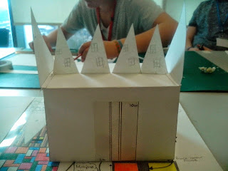
The past 8 weeks we have been looking at modern architecture including 4 architecture artists. For modern architecture we went into Barnsley town center and captured couple of photos of buildings around Barnsley. Also, for looking at 4 architecture artists we had to create research sheets. with all the artists work and a small amount of information about the artist. Our intended outcome was to have completed all the research sheets and have a final design and model of our very own modern building. When we began looking at 4 modern architectures, i chose architecture artists who people have never heard of before. Because i wanted to show more creative side for this project. Also, we had to choose various images of our chosen artists work. Then, re-create them, in different media such as; paints, coloured pencils, collage and pastels. Once all our sheets were completed and at a good standard of research we then had to create a design sheet of our very own modern architecture building. The artist i looked at was Tom Fruin, the reason why i chose him. Is because he has a great way of expressing colour into his work. And i liked how he uses bright colours and shows these colours by putting them into a rubeic cube way. Once i got some images of Tom Fruin's work i then got A3 paper and started my design sheet based around his work. I wanted to create a basic and simple building such as; rectangle base with triangle roof top. But we couldn't make our buildings big, only to a simple standard. On my design sheet i also had to make sure i added measurements and methods of how i was going to create my model. Furthermore, adding alot of colour. For my rectangle bottom base design i decided to use Tom Fruin's design with the colourful rubeic cube way. With the triangle rooftop design i decided to have stripy with dark brown, light brown and cream colours. Giving it a licquise effect (sweet). All together on my design sheet, my model has a charlie chocolate factory look a like in my opinion. Because it makes you imagine sweets and chocolate. At the time i had finished my design sheet, i couldn't go into the workshop to make my model. Because the workshop was full, but i was told to have a cutting sheet for the materials i was using to make my model and double check of the sizes and measurements. For my model design i needed: 6 triangles, 1 rectangle base, 10 squares (for windows) and 1 rectangle for my double door. The materials i chose was; clear plastic and wood. The colours i chosen was; red, blue, yellow, orange, green, purple and pink. After i completed my cutting sheet for all my pieces, i then had to make a template showing exactly what i wanted my building to look like. The things what went well was creating the exact design for my model and finished research sheets to a good standard. The things what went wrong was; the measuring and making the template. Because there were pieces what didn't fit, with them being different sizez. Everything else was good. I did enjoy this project, it was really intresting and fun to do. But, i wasn't too happy. Because i still haven't made my model.


Tuesday, 8 April 2014
Completed Experimental Portrait
Here is my final piece of experimental portrait. I am statisfied with the detail and outlines, including how i managed to draw my model straight away without using the square guide to help us. I really enjoyed this project. Because i love drawing and using different media, especially begin creative in my own way. Instead of people telling me what to do and use. I would like to do more portraits now. Because i strongly believe that i am getting better with my detail and outlines including the media i use.


Tuesday, 1 April 2014
3D model making template
Today's lesson i only had my template to make, of what my model building will look like. It did take some time to measure and make my template exactly how i wanted it like my sheet design. Once i made my template model i couldn't go into the workshop. Because the workshop was full up so i have next week to make my model building.


Experimental Portrait
For Experimental Portrait lesson, we began by taking photos of either ourselves or other members in our class. But we was only allowed to take these photos from chest to head. Because it was easier and more simple instead of going for full body portraits.
On my table we all decided to take pictures of each other and decide to draw whoever once the pictures was taken. Amy decided to draw Zoe, I decided to draw Amy and Zoe decided to draw me. When we got all our pictures (10x at least) we had to come to the decision of only choosing 4x best ones. Once we all chose our 4x pictures each, we then could start drawing our portraits. My tutor recommended that we should use a square guide to help us draw every thing and every detail in step by step with the squares. But I already tried and knew that technique and I was more confident just to draw the photo as I saw it. Also, we had the choice whether to add a background or not. I did, for my background i used ink and acrylic paints. With the ink i firstly poured a little amount on ink onto my page and then got a straw and began blowing the ink in different areas and style. Furthermore, once the ink was dry i then decided to add more texture by putting the acrylic paint into a cup of water and mix it. Once it was all mixed i then used a defuser and blew the acrylic paint on certain areas of my page. Then my page was looking for interesting once it was all dry. I could then start drawing, i at least had to rub it out 2 or 3 times. Finally, i was managing to get all the details and outlines and came out with a great portrait of my model. Once, i finished drawing my portrait i noticed that the background my model was standing was white and my background on my page wasn't. So, i decided to use Emulsion to cover up all the yellow, blue background to make it look exactly like the photo i was drawing from.


Subscribe to:
Posts (Atom)